I have been talking about doing a sketchbook review for a while so here it is!!
I have scanned a few pages in from my sketchbook and I will explain what I have done on the page what I think has worked, what I like and dislike and how I could have improved!
I started my FMP on Tuesday 12th March as the day before I was so ill and did not feel well so I just rested for the day. On the Tuesday I was still not 100% therefore I decided that I would do some secondary research and watch Elizabeth: The Golden Age and draw from the film.
 |
This is the first page in my sketchbook. I have created a fabric swatch drawing of the detail that was in the dress that I had drawn as I did not want to ruin a lovely continuous line drawing. I will admit it and say now that I DID pause the film so that I could see what it was and what angle I wanted to draw from. I have also along the bottom which you can not clearly see quoted part of the film from this scene that I found interesting/important and wanted to make a note of. The colour on this page has been created simply by using watercolours.

This again is a continuous line drawing from the film. I have mainly concentrated on the colour blue as it was a main feature in that scene. I feel as though there might be something missing from this page and unfortunately it is not the whole of the double spread as it would not fit on my scanner so I am sorry about that! I think I should have possibly added some form of text or a background or something else as it feels as though she is floating on the page and to me it feels slightly boring.

This is one of my favourite pages that I have created! I have used this image in my CAD mood boards which I posted about, if you have not seen that post then <Click Here>. I think that the yellow is really bright and vibrant and I just really like the way that I have set everything out on this page and the pattern which is on the left of the page was an over head shot in the film that I really liked. This page really pops out and is very much a stand alone page. Although there is a lot of information on my page, I think that it is nicely set out my the use of the yellow shade. Queen Elizabeth is in painted in a brighter harsher yellow and the pattern is placed on a more washed out yellow. This is purely due to the fact that my paint brush was not large enough to fill the page the way that it should have and it leaves this nice wash out/ streaky background.

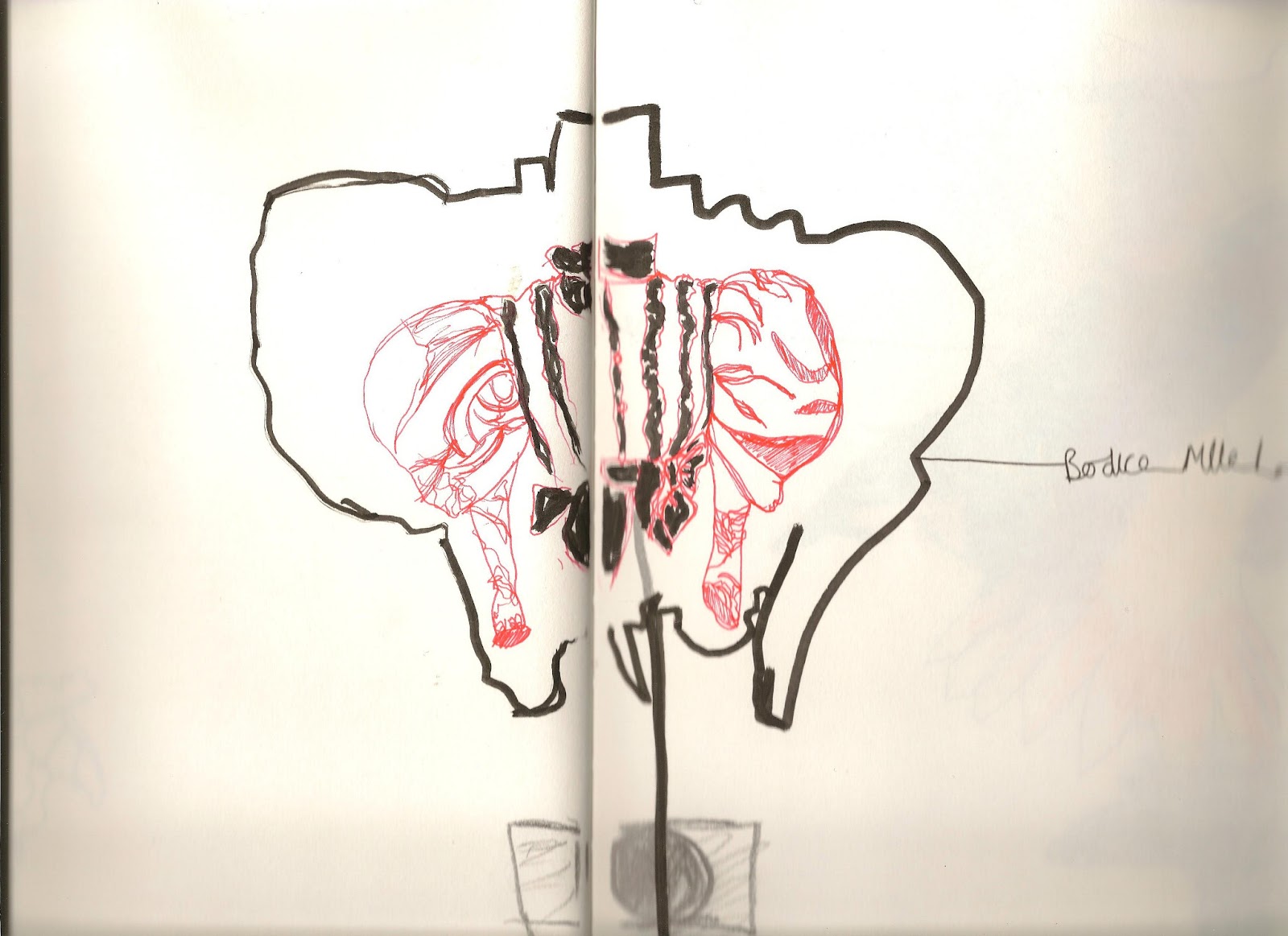
This page is also another image that I used for my CAD mood boards. I decided that this page was right for my 'Ice Royal' colour scheme spread as it is all blue and white with slight colour. I really like the way that the ink has run in this image and how the lines look soft but with shading.
*This technique is really simple but effective, to do this you will need an inky ball point pen, a paint brush and pot of water. Firstly draw you image like you would any other, using a wet paint brush with ONLY water (be generous) you paint along the lines. Quickly after doing this you get your pen and draw over the line below, the ink will then blend with the water but still show your line below. Repeat this until you are happy with the way it looks. I will also put up a demonstration tomorrow :)*

I really like the layering of this page. This page originally only had the smaller drawing on it, however I felt that there was something missing and later on in the film Queen Elizabeth was wearing another blue garment so i made it seem as though this was the main feature image and added more violet and blue into the water colouring.
On Wednesday 13th March I went to London with my friend which I have previously posted about, <Click here to go to that page> While I was there I took advantage of all the primary research that was around me. I loved that day although it was rather hectic and I had to take my medicine with me... BOOOOOO!


These pages are a lot quieter then the ones above from the film that I watched, however I have not used a lot of watercolour and I have concentrated on just line, tonal, dotty drawings. I tried to incorporate all the skills that we learnt in the first term of this course.
This is all that I am going to show for now as I do not want to bore you and I have missed a few pages out so I shall try and get that done for tomorrow.
So either Good Morning, Good Afternoon or like me Good Night
Melanie Katelin
xo
No comments:
Post a Comment